Attention, art loving gift givers. Christmas approaches, and with it the need to buy gifts for your nearest and dearest.
And what better or more appropriate Christmas gift than a 5-pack of postcard reproductions of a small painting of Hardwick park in sunny Derbyshire on a sweltering day in July?
This is available in the UK for a very reasonable and post free £3.25. Just click on the Paypal button below and my mighty publishing empire will spring into action to make sure your handsome postcard pack is delivered to your door post haste.
Painting is hard. Promoting your work on top of that can be an uphill struggle, which is why using printed material to do the job for you is a good idea.
Perhaps you have an online presence already, but a hard copy of your work, in the form of a printed postcard reproduction of one of your best paintings, is a calling card you can send to galleries or potential buyers. If it's pretty, it gets to stick around, a real world, lasting reminder to everyone who sees it that you're out there.
I finally got around to doing this last week, and thought I'd do a step by step in case anyone else was wondering how to go about it.
Step 1: Choose your image.
This can be the hardest part. Make it as easy as you can, like this...
Gather all the potential images you think could make a good postcard. Stick them into one folder on your desktop.
Choose recent images over past successes, to better represent the kind of work you do now. Pick your best work - you know which of your paintings are better than the rest. And lastly, pick paintings that have impact. You want an image you can read all the way across the room when it's only as big as a postcard.
Open the images in Windows photo gallery, or whatever slide show viewer your system supports. Click through them, one by one. Take your time. Narrow down your choices. Keep the proportions of the finished postcard in mind. An A6 standard sized card is 148mm x 105mm, around five and seven eighths by four and one eighth inches, or roughly 3:2. Remember your painting might not fit those proportions exactly, and that you may have to leave space around your image.
Got the picture you want? Sure? Stick with it. Once you've made a choice, remember that the investment is small enough that any second thoughts don't really matter. Don't second guess yourself.
Step 2: Prepare your image with GIMP.
Now you have to get the image print ready.
Is the image you chose the best image possible of the painting? It needs to be good quality, sharp and clear, with accurate colour and tone. That murky snapshot you took on a dull day with your phone set to potato? Yeah, don't use that. It won't magically turn into a high quality pin sharp printed card.

There are articles online about how to take good pictures of your artwork, just a Google search away. I use a DSLR set to 200 ISO and photograph my paintings flat on the floor lit by direct sunlight. Using my legs as a tripod..., well, bipod anyway, I stand directly over the piece and make sure I photograph it square on. Not recommended for larger pieces, but good enough for small paintings.
I make JPGs at the highest setting, 3872 x 2592 pixels, which seem to be adequate. I open them in GIMP, and cut them down to the outline of the painting like this: use the Rectangle Select tool to draw a box around the painting, then go to Image, Crop to Selection. I also use the brightness and contrast tool under the colour menu - lowering the brightness and increasing the contrast, just a little, gives a full bodied, colourful and contrasty image.
Make an A6 postcard template in GIMP, like this. Open a new, blank image - File, New - with the following specifications:
1712 pixels wide by 1228 pixels high (assuming a horizontal image).
Under 'Advanced Options', make sure its X and Y resolution is set to 300 pixels per inch. The colour space is RGB, which we'll talk about in a while.
Now, resize your painting's image so it fits neatly into that blank template. Don't distort the painting's original proportions to make it fit. Make sure that it's no bigger than 1712 x 1228 pixels, and that its dpi count is the same at 300 pixels per inch. You can do this is GIMP by accessing Image, Scale Image, and Image, Print Size.
Copy your image by going to Edit, Copy Visible. This copies your image to the clipboard. Close your painting image, then go to the blank template and choose Edit, Paste As, New Layer. This will place your image in the postcard template, where you can move it about until you're satisfied with the layout, using the move tool from the Toolbox. (Looks like a cross made of arrows.) If there's space around your image, make sure it's symmetrically placed.
When you're happy with the result, go to Layer, Merge Down. Then export it to your desktop as a PNG file.
But we're not done yet...
Step 3: Prepare your image with KRITA.
GIMP, like a lot of Open Source software, is a marvellous, highly specified program which will do many things really well.
But it won't export to CMYK, which is what printers want.
You could bite the bullet and buy Adobe Photoshop (or just pirate it should you be so inclined, NOT THAT I WOULD EVER RECOMMEND OR CONDONE SUCH A COURSE OF ACTION IN ANY WAY, at least not while any patent lawyers are listening) or...
You could download some more Open Source free software. It's called Krita, you can download it here and it's an interesting drawing and painting package with a complicated front end which I haven't the patience to learn properly but which can convert your image to CMYK and output a printer ready PDF file.
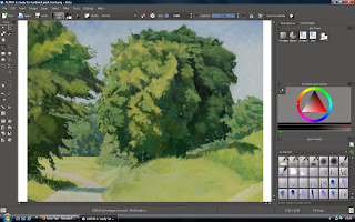
Go to Image, Convert Image Colour Space, Model: Cyan Magenta Yellow Black, Depth: 32 bits float. I have no idea what the other options mean, but I think they set the hyperdrive for Arcturus. Press OK, and wait while your computer huffs and pants through the process.
Then, File, Export as PDF, and Robert is indeed your father's brother. That PDF file is what you're going to upload to the printer. Along with another one for the rear of the postcard, where you will include the title of the piece and whatever contact information you want to put on there, be it a URL or an email address. You can make that in GIMP using the same postcard template which you already saved as 'A6 postcard template', right? Use the GIMP text tool, which gives you complete control over font choice, style, colour and size. When it's done to your liking, go through the same process to prepare the PDF for the rear of the postcard.
Step 4: Pick a printer online.
This is the part which could have you curling up into a foetal ball and whimpering softly.
Or, if you live in the UK, you could just do what I did (after a lot of Googling and cursing) and go with Printed.com.
No, I'm not an affiliate, nor do I get any kind of backhander for recommending them. Like any firm I promote on here, it's as a direct result of their good service.
I picked them because my first choice led me all the way through the order process only to lose me at the checkout when I found out their delivery charges cost twice as much as my order, because they were based overseas.
Printed.com, on the other hand, are based in the UK, use the ordinary post, and only charged me a few quid for delivery. Also, their website's online ordering process was easy to use, and their prices compared very favourably with the other online printers I looked into.
Using their online order process, I uploaded PDFs of the face and rear of the postcard and paid for my order.
Ordered online on a Friday night, my postcards turned up neatly and securely packaged the following Wednesday morning.
And that's how to get a postcard of your painting printed. I must admit to having been a little worried while I waited. My monitor isn't calibrated, and I've had one disaster with an online photo printer returning photographs so dark you could barely tell what they were, but this postcard turned out really well. I'm more than happy with the result, and I'll be using Printed.com again.

A year after my first Hardwick painting expedition I went back on a Saturday in July, hauling my portable easel and a rucksack crammed with cameras and drawing books.
Unfortunately, the suntan lotion got left behind, which is a mistake you should not make if you're going out plein air painting in this weather. Also, take water. And a hat. At some point I'll write a post about the necessary kit for plein air survival in different seasons, including a special section on the appropriate hat.
My painting spot was a little way down the hill on the road that goes past the Hardwick Inn. I worked sight size on a 10" x 12" panel, drawing with a small brush. The good thing about the Winsor & Newton oil primer is that in the early stages of a painting you can wipe out mistakes with some turpentine on a rag and make it look like they never happened, something I had to do twice over before I was happy with the drawing.
I painted for close on three hours, which was only possible because the spot was shaded by trees. Passers by came and went, and were universally polite. If you look busy enough, they hardly ever interrupt you. I knocked it on the head around 2 and strolled home.
Happy enough with the resulting painting, I went back the next Saturday to finish that panel and begin the next one.
.png)
On the way back from that trip I stopped to draw a tree in a field on the far side of Rowthorne. It made me think about what attracts me to a subject, just what it is I see that'll have me standing there in front of it for an hour or more, trying to get it on paper. Sometimes it's the textures, as much as anything. In this case, the silken heads of a barley crop, which will translate directly into juicy brush marks in an oil painting, or be lifted out with a a wet brush and tissue paper in a watercolour. The soft edged darkness below the tree in the middle of the barley. The lazy perspective of a ragged hedgerow taking your eye back towards the luminous sky. Some days, the world looks like a length of gorgeous fabric.
.png)
On the third visit to Hardwick, I found the missing cattle, which had hitherto been absent. They huddled in patches of shade around my painting spot, eyed me like members of the Conservative Women's Association inspecting a vagrant, and pooped on the ground occasionally. They are very decorative cattle, with impressive horns, straight out of a Bewick woodcut. I took a few photographs of them when I had time, and started a drawing from those later.
.png)
Downloading a cow's anatomy illustration helped to sort out how they're put together, and after that it went well, so my finished Hardwick painting may contain livestock. I'm just happy they didn't try to kill and eat me.
At some point I'll spend the necessary six quid to peruse the gardens around the hall, and take photographs for a possible painting of it. (This is how I know I'm getting old. Small sums of money sound like large sums in my head. Six pounds is more than I used to spend in a weekend of carousing. Now it buys two beers or a single tube of paint.)
Surrounded by a wall, and perched at the top of its grounds, Hardwick Hall doesn't really lend itself to the full stately home treatment in terms of painting, but I think I could get a handsome picture out of it. I have black and white photographs from my last visit, back in the 80s, some of which you can see in the post.
.png)
Some nice statuary in there. I'd quite like some statues for my own back garden. Perhaps I could make room beside the compost bin, and trim the privet behind it into topiary. I also have enough rocks to construct a modest grotto, in which I could sit to welcome visitors, lured in by the hand written sign leaning against the gatepost.
'Warburton Towers. This way to the gardens and tea room.'
Hmmm... how much to charge them for the guided tour?
'This patch of weeds is where the neighbour's cat likes to sit and ambush mice. That dustbin lid is where I scatter birdfood. Yes, those were peas, but the slugs got them all. Don't stray into the raspberry canes, it's like a Vietnam flashback in there.'
Some days, painting is like ringing a bell. Other days, it's like pushing rocks uphill.
And some days - not too many, thankfully - painting is like trying to reverse an excitable bull out of a china shop without breaking anything, while keeping one eye peeled for whoopee cushions.
Seriously, do you ever have days at work when you just know that if you even think about making a single move something expensive will fall over, or catch fire, or probably both, for no good reason?
On those days you are the plaything of the fates, and the best thing you can do is sit on your hands and resist any and all urges to do something useful. Because if you attempt anything - anything - at all, you will not only fail, but fail in so spectacular and horrifying a fashion that people will ever afterwards speak in awed tones of your abject incompetence, and cross the road when they see you coming. Just in case it's catching.
It's one of life's hardest lessons: some days, you can't do a damned thing right.
On those days, I kick back, do a crossword puzzle, maybe catch up on the gardening and odd jobs around the house. The ironing gets done. I might cut some MDF to size, or think about ordering some paint or brushes.
What I don't do is go near whatever painting I'm working on. Because it would explode.
I also don't worry about it. Because I know those days never come two together, and tomorrow will be great because I had a break.
My advice? If you break a window trying to get the screw cap off a tube of paint, you should maybe take the day off and do something else.

Back in March I spent a couple of hours sorting through what I'd done since last September in my six monthly review. A quarterly review is a good way to keep track of productivity, progress, and problem solving. If you can put a name to what you need to change, it's easier to handle.
In the past year, I'd started 30 paintings, and finished 24 of them, nine of which I wouldn't be thoroughly ashamed to frame and exhibit. Add to that 8 quarter imperial (11" x 15") drawings and about 120 drawing book pages.
In looking back through a year's worth of work I made a list of twelve points that need fixing in future paintings, which was the whole point of the exercise. When you spot your mistakes, you can give them the attention that will mend them.

This year, I'm going to produce more. The aim is to produce enough viable paintings to stock several commercial galleries. That's going to be my main focus now I have my areas of competence mapped out, and systems in place to expand on those.
Does this sound too coldly mercenary? Well, with no other saleable skills*, and having developed an unfortunate predilection for paying my bills, wearing shoes, and eating six or seven times a day, it's necessary.
* Unless you need an ornamental hermit.
When I'm not painting I like to trawl the internet and see what painters I can find.
I found Duffy Sheridan's videos on YouTube, and they're well worth a look. His somewhat distracted* commentary gives great insight into the thought processes of a painter at work. I recommend doing an image search of his paintings, they're gorgeous.
I came across Ryan S.Brown's landscapes while looking for another painter's work, and I eventually Googled him and found his website. That links to this splendid article about his work process as applied to a large landscape painting he did, as part of a Hudson River School Fellowship award.
* It's hard switching between painting mode and talking mode when you're working, as anyone who has made a YouTube instructional video will verify.
Lately, I've noticed that my wide ranging palette has shrunk, to ten go-to pigments that cover all my needs:
Titanium White
Cadmium Red
Spectrum Orange
Cadmium Lemon
Oxide of Chromium
French Ultramarine
Permanent Mauve
Yellow Ochre
Raw Sienna
Burnt Umber
I have a paint mixing ritual which suits almost every painting: French Ultramarine and Burnt Umber, mixed to make a black. White added to this to make a range of greys. The black added to Oxide of Chromium for a shadow tone green, then separate greens mixed with Oxide of Chromium and Yellow Ochre and Cadmium Lemon, for the light side. The greys end up in the clouds, while sky blue is mixed from Ultramarine and white.
When things get too green, the Cadmium Red and Spectrum Orange kill the bilious notes and liven things up. The basic colours can be turned warm or cold as needed - yellow greens for grass, blue greens for nettles, violet blue for evening skies, cool blue for cool days.
So, shrinking palette, good or bad thing? It could be the main reason for my samey colour chord, as noted in this post, but that could equally be taken as a sign that I'm getting it right - I've accurately caught the colour scheme of the small patch of land I paint.
Some colours I stopped using because I found them too difficult. Viridian, for example, gives me problems. Too cold on its own, odd and out of place in tints, too assertive in mixed greens. It makes a good black, and beautiful greys, when mixed with Alizarin Crimson, but I currently have no use for those colours.
I've just started a small painting using a restricted palette, and I went with Burnt Sienna, Golden Ochre and Indigo as my red, yellow, and blue. Three primaries and their mixtures should be enough to take you through most of your colour solid, but the compromised colours of these three pigments provided an extra challenge.

As an exercise, a restricted palette is good because it makes you think hard about colour choices, and really work the pigments you've allowed yourself. So far, the painting doesn't seem particularly less colourful than previous paintings that used a wider range of colours.
Next week I'm going further afield, so we'll see if I find new solutions for a new landscape. Meanwhile, here's a drawing of a horse in which I mucked up the head.


.png)
.png)
.png)
.png)
.png)



